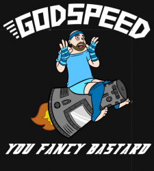
This shirt design is kicking my ass but I think it’s getting stronger with each revision thanks, in no small part, to your suggestions.
After completing the Josh art I am leaning one of two directions.
Josh by himself:
Or the original layout:
Joel, Eli and the planet in the background will be light or ghosted. Probably grayscale.
I like the text much better in this split configuration. I hope to wrap this up and get it in the store in the next day or two, so get your feedback in as soon as possible.
Oh, also I’m thinking this will work best on a black shirt. Any other ideas?
-Joel


I prefer the one with Joel and Eli in the background. And it looks good on black. Works for the whole "in outer space" thing.
Yeah I like the one with the two of you saluting him…just seems more fitting to me.
Definitely a black shirt (we ARE geeks, after all) and it really needs Joel and Eli, both to tie it back into the comic and also just to strengthen the whole "godspeed" vibe you've been aiming for. A planet, even ghosted, starts to feel like overkill to me; too busy, I prefer the simplicity. It's going to have http://www.hijinksensue.com across the back, yes? In smaller text near the neckhole, like the PA shirts.
Also, the rescaling of Josh vs the Gemini capsule is well done.
I agree.
Another vote for the Joel and Eli background, wishing "Godspeed" to:
Jazz Hands In Space (space…space…space…space…)
Yeah I agree; Joel and Eli are saluting are essential, the planet not so much. Great t-shirt design man! And way to listen to your fans
Another vote for the one with Joel & Eli. Dark blue would be good too I think.
Also, re-started (and finished) the BSG miniseries last night. Oh that Starbuck, shes a son-of-a-bitch!
I like the thought of having Josh on my chest…
I like it where the whole cast is involved. I might sugesst that you pull the saluting hands back just a bit so we can get more of a full face look at Joel and Eli. They don't have to be facing Josh. You can do a "stage cheat", turning them to a 3/4 view towards the audience.
I like the one with everyone on it. I think I like the old astronaut design better, but this one's good too.
OMG I love them both, but the second is better. yes please I want 2 now, does it come in 12 month old baby size? olease say yes.
I like the second one aside from the circle in the back ground.
How did a 12 month old baby learn to type? That's amazing!
Another possibility is using a more "military" like salute; the army's version has you basically touch the tip of your finger to your eyebrows.
I still like the pink josh from the original designs…
It needs more zazz… And maybe cowbell…
Another! Joel and Eli, check. Planet, whammy!
I have a fever. And the only cure is more cowbell…
Yeah now that I look again, it kinda looks like they are shading their eyes to watch him rocket away. Moving the hands to the left a bit would help that alot.
I prefer the one with Joel and Eli in the background, without the planet. The planet makes it a little too busy. I'm also not sure about the rocket swoosh, though it does help give the illusion of movement.
OMG, a million times I vote for the second one! hahahahahahahahaha
As of now its for sale in the store!
Thanks for the input. Thats the design that won out!
Its ready to go!
Well, his "character" is the face of that one shirt.
Josh's expression sells the whole damn thing. Stick either one of those on a Beefy T and I'll buy it.
How does Josh feel about being the face of your comic? Or potential face?
Quick dicking around and let us by one of these things!