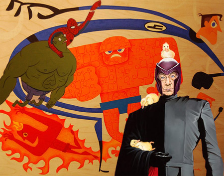
i09.com posted a story about a gallery in LA featuring new twists on classic Stan Lee characters. The Fantastic Four remind me of the outro sequence from The Incredibles.

(this mashup is NOT one of the actual pieces. It’s like 3 of them blendered)
i09.com posted a story about a gallery in LA featuring new twists on classic Stan Lee characters. The Fantastic Four remind me of the outro sequence from The Incredibles.

(this mashup is NOT one of the actual pieces. It’s like 3 of them blendered)
If you’ve been reading HE for a while you no doubt have noticed that I play with the character designs pretty often. The truth is, I am still trying to settle on a style that I am happy with. The comic is young, and these are care free, experimental times so I’ve just been having fun with it. Well, that’s over. It’s time to grow up, get serious and start drawing my silly cartoons consistently like a man.
The top row in the image below shows the direction I am leaning towards. The bottom row are pretty realistic caricatures of me, Josh, and Eli. I drew them from photos then used them as templates to “cartoonify” the characters.
You will probably at least see the new style (top row) on the next comic. Whether or not it sticks will depend on how pleased I am with it and certainly on your feedback. This is a pretty important decision for me so any thoughts good or bad would be appreciated.
UPDATE:
Since I’m getting some confusing feedback, I assume I wasn’t clear. The TOP row is what I plan to use. The bottom row is the more realistic caricatures that I used for reference. I just posted those so you could see where I was coming from. The top row is close to the style I have been using lately, but more defined. Does that change anyone’s suggestions?

Also, Fake Steve linked to the last comic (which was about him). Cool guy. You should read his real fake blog.
“Dude, I invented the friggin iPhone. Have you heard of it?”