UPDATE (4/10/08 @ 1:45pm):
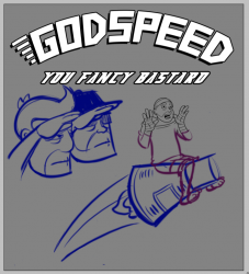
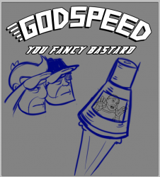
I’ve been reading all the suggestions and messing around with new design concepts. I normally would just design the shirt and put it in the store, but this one is special. It’s the “I’m A Fancy Bastard” shirt. This brands you as an HE reader because NO ONE ELSE could ever understand it. Taking the best bits from all the suggestions and mixing them with my own ideas I’ve come up with these:
Ignore the background color. I just used a neutral gray to sketch over. I think Joel and Eli would be in gray tones kind of in shadow.
Thoughts?
UPDATE (4/10/08 @ 2:56am):
Ok, so it seems the consensus is “Why is he an astronaut? That isn’t very fancy.” Oh well, I tried. Check the comments to see the next direction I went in: SUPER FANCY JOSH IN FLASHDANCE GEAR. I finished it and hated it.
I’m not going to cling to the first design with a death grip if no one likes it but what about something like this?
Can I fancify the space suit?
========================================
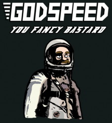
Here’s the first design I’ve worked up for the GYFB shirt.
(click to enlargerate)
I’ve gotten a couple of positive comments and a couple of “why is there a guy in a spacesuit?” type comments.
The idea that hit me the first time I said that phrase outloud was that it might be a take off of “Godspeed, John Glenn,” so I’ve always had a 1960’s astronaut in mind. I also think it came out looking pretty cool. But then, the shirt isn’t for me. It’s for you. So what do you think? Would you rather it just have the slogan and no graphic, or do you dig astro-josh and his reverent stare?
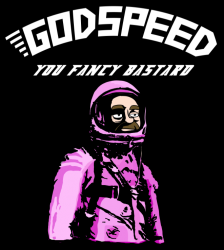
This is actually the design formatted for a black shirt. I am also planning a charcoal, and a light blue for the ladies.


I like the new updated shirt concepts better. My favorite would have to be Josh sitting on the rocket.
Love the new concepts 😀
Certainly the first of the two in the second update puts the bump on the pickle! However, on a more sober note–his rocket blast seems awfully flaccid. It's less a question of where Josh is going, as where he's going to land. Then Apache Chief and Wonder Woman would grow gigantic and retard/monstrous and stomp around the desert.
Ooooooh… and can you do a lenticular effect on the jazz hands? So you can see them being jazzy? Oh! Oh-oh-oh! And the glitter laser-beam eyes! Oh! And maybe make the blast be glow-in-the-dark?
I would totally wear that if it came in a baby tee
FUCK YES.
The one where he's riding the rocket; that makes it a voluntary trip, which carries off the same feel as the strip that's inspired this whole exercise. Plus, I mean, he IS homosexual. The symbology of a gay dude riding a rocket is so juvenile-perfect.
The pink josh is the best, fantasmagoric…
I like the 2nd myself.
Two things bother me slightly about the designs with the Mercury capsule:
1. the capsule is way out of scale WRT Josh.
2. where's the booster rocket?
That aside, the Strangelove/Flashdance riding the rocket to oblivion pose is good.
I think this is the way to go. You're the foremost person in the line, doing a regular salute. Eli is next in line, also saluting, but you need to give him a schtick of some sort, probably mildly offensive like put a sombrero on his head or something. But nothing too big, he should me mostly normal. And then last in line is the fancy bastard himself, being fancy. Either the jazz hands or a salute with one hand and an "I'm a little teapot" with the other hand, or just the whole teapot pose. Then dress them accordingly.
Hmmm, ok, late to the game and didn't read all the way down, I assumed the pod pics were the first test versions. So, Josh on the pod, but way back in the flashdance end-of-dance getting dumped on pose being showered by stardust (which my ex and I always pronounced in the gayest way possible when talking about the movie Stardust).
Wadmaasi Said:
He needs to be in a hammed-up WWI flying ace outfit; goggles pushed up on forehead, cute little leather helmet, flamboyant scarf…
An astronaut's spacesuit just doesn't look FANCY enough.
—————————–
What I I were to fancy up the astronaut. Like with a tophat and a monocle?
i'd go for just me in my flashdance outfit
I'm all for Josh in anything leather!!!!
Oh right… Feedback…
As much as I love everything you create, I think the saying is funny enough without illustration.
I like the whole spacesuit angle… but it's not fancy enough… maybe if you put him in one of those old Star Trek TOS spacesuits? Those were fancy…
*…*
No wait, come to think of it they were just funky…
A monocle would be pretty impractical/hilarious, especially if it were to fall off… no way of getting it back in place in the suit. 😛
Anyways, what I'm trying to say is: Me likey. Me likey very much.
Seconded!
But I hope you realize that what I really, really want is a "Caress this shorn badger!" T.
Yeah, the shirt's pretty kickass, but it'd be kickass-er if you went with the WWI pilot idea.
And pose him like Captain Morgan.
Yeah, that'd be totally fancy.
Thirded. I was kinda looking forward to seeing Josh recreate the audition scene.
Ok, what about Josh, in the flashdance suit but ALSO wearing the flight goggles and a scarf and maybe a leather pilot helmet?
Feedback is appreciated since I dont want to spend 6 hours doing this if its going to suck.
how's this?
http://www.flickr.com/photos/cubinplano/240195979…
That is indeed fancy. I now have NO IDEA what Im going to draw. Maybe I'll trace over that picture… and add a monocle and top hat.
gotta make the shirt big enough for it to hang off one shoulder.
he looks like a trapped Zod.
An astronaut with a monocle and a tophat? Like a combo of John Glenn and Rich Uncle Pennybags? Hell yes!
@ Josh: Ha ha, you really do have short fat fingers. 😉
On second thought, the tophat would truly be overkill and take away from the astronaut helmet. A monocle would be classy and, more importantly, fancy – I'd definitely add that in.
http://hijinksensue.com/wp-content/uploads/2008/0…
http://hijinksensue.com/wp-content/uploads/2008/0…
http://hijinksensue.com/wp-content/uploads/2008/0…
Nice I definitely like the addition of the pink, ups the fancy levels …and the gay levels but that's a good thing.
How's about flashdance Josh (I feel like a middle-aged Barbie collector) riding a rocketship, a'la Dr. Strangelove, bare-back, as it were, with the slogan blasting out the rocket bell? And maybe laser-beams blasting out of his eyes, in totally rocking glitter? Can you print glitter? And maybe shred the ends of the sleeves and the shirt, in that spaghetti type stuff. Maybe watch the last part of Xanadu (a netflix WatchNow title) and just got to 1:24, to get some ideas.
I like the first astro-Josh. He needs some mission patches on his sleeve though. And a monocle.
Rhinestones?
Bedazzler spelling out "DISCO LIVES" and a disco ball!
Personally, I like the originals concept for facial expression. It just seems like he shuold be straight faced for this tee shirt. Maybe a pose like http://tinyurl.com/5nzjm9 (but reversed to face right), only he's earing the top hat and monocle? You could even put the cane in the other hand. The suit on that action figure is bland enough to allow for tons of 'fancifications' . I only really linked it to show the pose.. and well.. because that's amazing that there is a toy looking like that out there. (fyi, did a google image search for 'fancy astronaut' and got that.)
must have jazz hands. the pink suit makes him look too much like hello kitty darth vader…I like the wording straight as opposed to curved,how about josh in flashdance garb saluting, that makes sense.
Way late to the party, but here is my eleventy cents. I like the pink spacesuit but DRAW IT SO IT MATCHES JOSH mr. photoshop cutout filter. It doesn't hang together so hot right now– especially the lighting.
I need to go on record as being against a tophat and/or monocle; it's too Twisp & Catsby.
How bout just a rainbowed visor instead of being able to see a face.
I'm not (frankly) excited about either design.
I like that "fancy" was about being in a NERDY MUSICAL (I can't believe how happy I am that such a thing will exist). We're all geeks and while we're not all gay, I think we're all gay for Joss… is there any way to maintain a geek factor AND a gay/fancy/musical factor? Can you use Fillion (as Tightpants or otherwise) or NPH without getting sued out of existence? Because like… Josh in his flashdance getup inbetween these two with their arms interlocked in a sort of "Chorus Line" is really working for me. Something that places "fancy" in the context of being geeky, too.
could be just me >.>
An ecstatic Flashdance Josh on a rocket with GYFB arching over him holds a lot of appeal for me. Might satisfy everyone's needs.
Nerdy + fancy + space = FTW?
Not feeling this one at all. I agree that the power lies in the statement itself, but for some reason now I can't shake the idea that an illustration involving Josh and a monacle is key to pulling this off.
My vision for the GYFB shirt would be the three of ya in an angled line saluting in some sort of costume Godspeed above, and you fancy bastard below (I hope that makes a lick of sense)
Jesus was an Astronaut? That is the coolest thing evar!
I did ACTUALLY DRAW it, albeit from a reference photo.
I might do that.
you're on to something.
Duh. Thats how he knew magic.
Thats funny, but also lawsuity.
IT does. I have a similar vision but am having a really hard time translating it.
Flashdance all the way.
A quick idea, it took me about 45 seconds to make (googled salute, and found me a starsky and hutch font.. because when I think of fancy bastards in this light, I think of them) http://tinyurl.com/667vug obviously it would be you 3 saluting, not military people. But that was the idea I saw in my head. (ALL 3 would be in flashdance clothing)
OK, check out the most recent updates.
I like it. Check out the updated post.
I like it. Check out the updated post.
I like that a lot better. I like the one where he's inside the pod. Although it does kinda of look like he's being sent away against his will. But having a fabulous time.
I like your take on it, but like Nacho, I do like the pod one better. This means I will most definitely be buying one of these, as I help shape it 😀
Seems like the general consensus is that he should be riding the rocket.
it certainly will.
I liked it too. Maybe Ill make it a desktop.
I wonder if I should make it a more generic "rocket"
I could put a trail of stars in the rocket exhaust. hmmm…
And a rainbow and you've pretty much covered the fancy bit.
Well.. So say the masses, so say we all. I don't have a problem with him riding the rocket. He seems to be enjoying himself.
Total agreement. Good job on this design, Joel – a little tweaking and you will be there.
I actually like the one of Josh straddling the rocket as it brings to mind the "Ambiguously Gay Duo" SNL sketches.
last question: do you guys like the space capsule or should it be a more traditional rocket (nose cone and fins and such)?
I do like the Mercury capsule idea because it fits with the "Godspeed, John Glenn" reference, but I would make it a bit bigger and put it on top of an Atlas booster (just the top part; most of it would be off-frame).
I am a contractor at NASA, and I agree: it's not very fancy. Cool but not fancy.
Josh should be riding a deorbited space station burning up in the atmosphere. More work, but at least more factual.
"WHATS EVERYONE LOOKING AT?!"
"NOTHING!"
Given infinite time and resources I would certainly make that shirt.